| project: Lukumades Acropolis | status: completed | location: Acropolis, Athens, Greece |
| type: interior transformation | design: Karagianni Nancy | photography: Bessawissa studio |
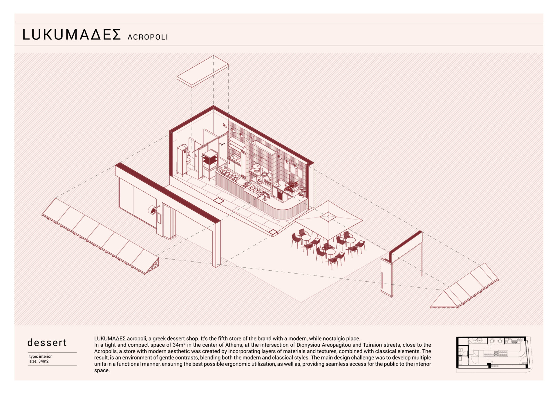
| size: 34sqm | 3d modeling: Lazaridis Dimitris |
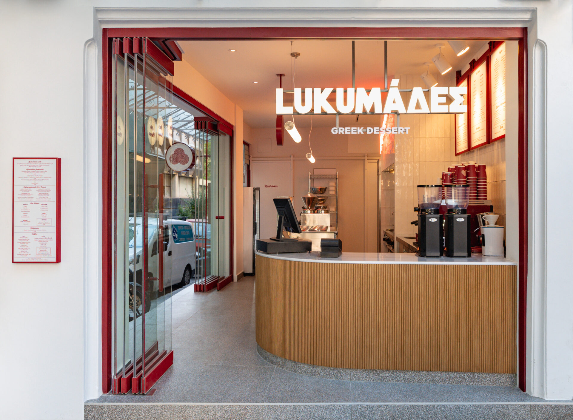
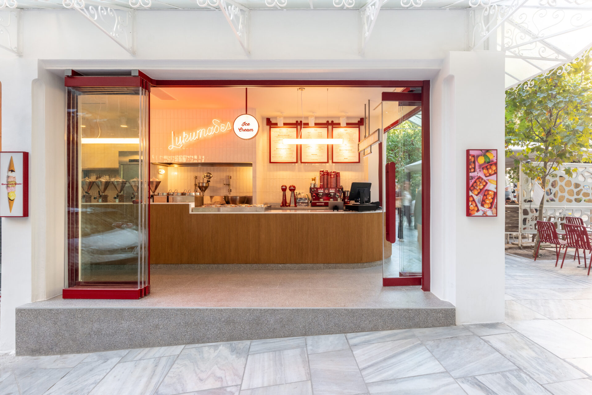
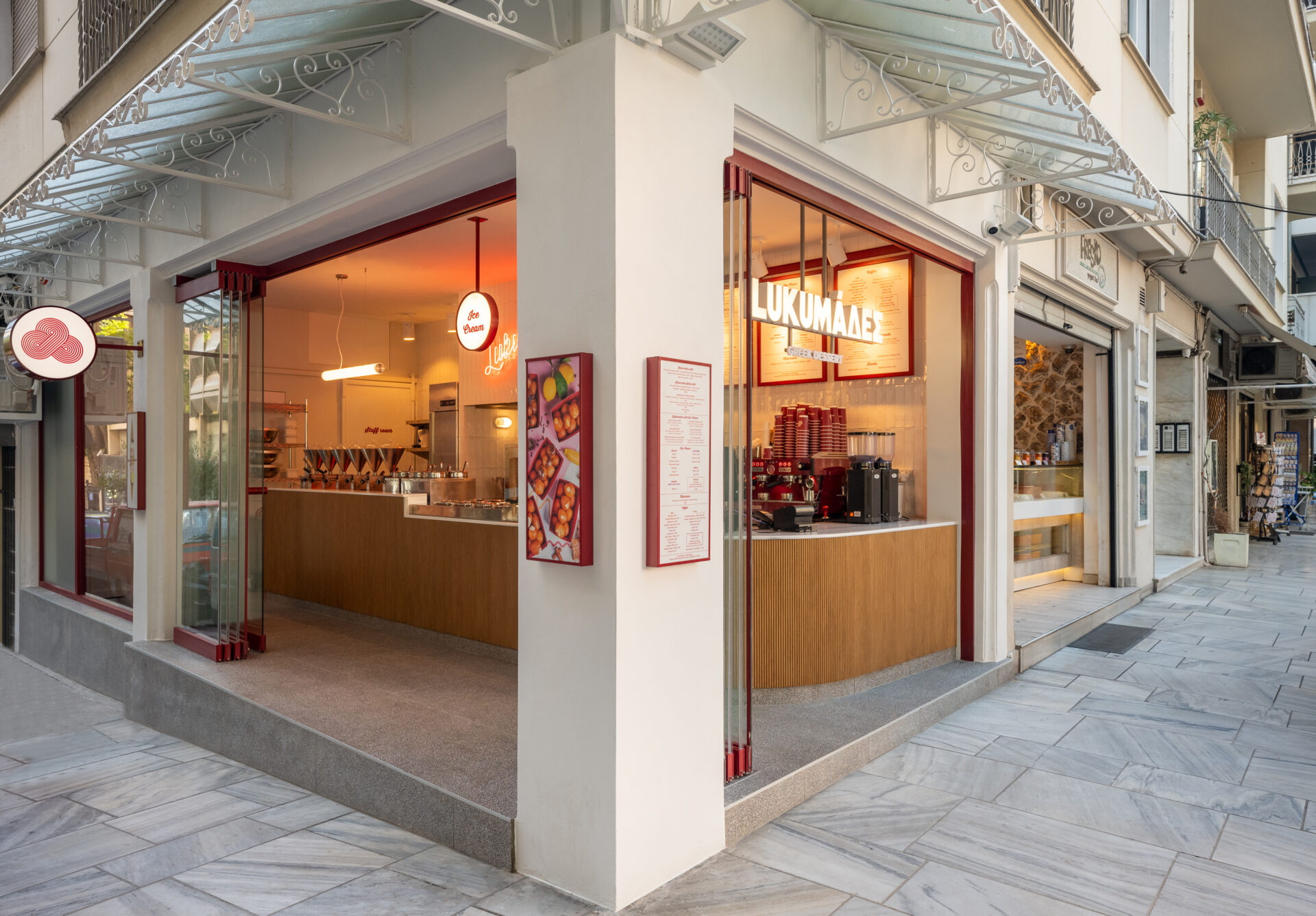
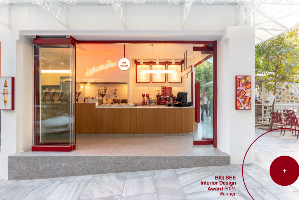
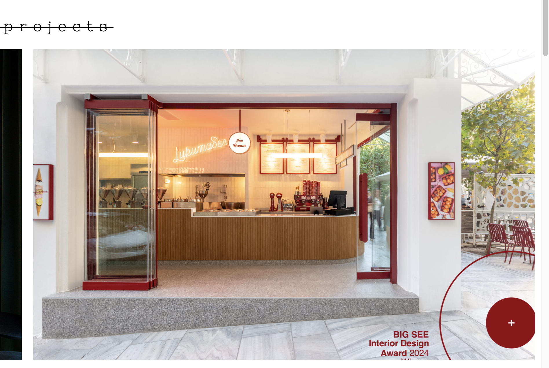
In a tight and compact space of 34m² in the center of Athens, at the intersection of Dionysiou Areopagitou and Tziraion streets, close to the Acropolis, a store with modern aesthetic was created by incorporating layers of materials and textures, combined with classical elements. The result, is an environment of gentle contrasts, blending both the modern and classical styles. The main design challenge was to develop multiple units in a functional manner, ensuring the best possible ergonomic utilization, as well as, providing seamless access for the public to the interior space.
In the past, the space hosted a souvenir shop and later, for several years, a coffee shop/restaurant.
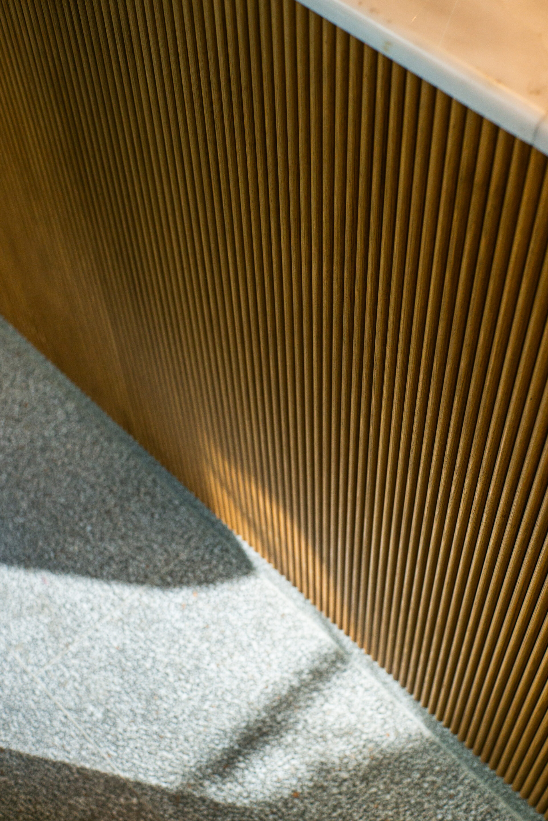
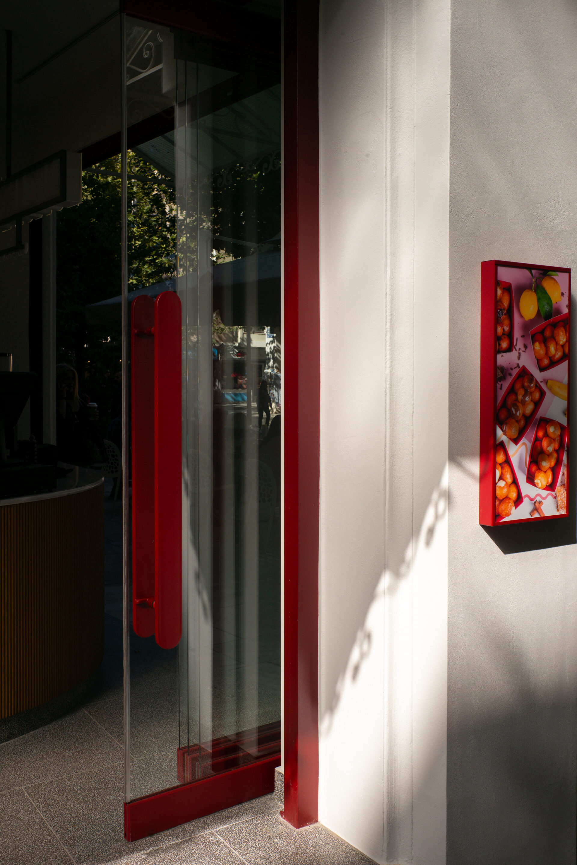
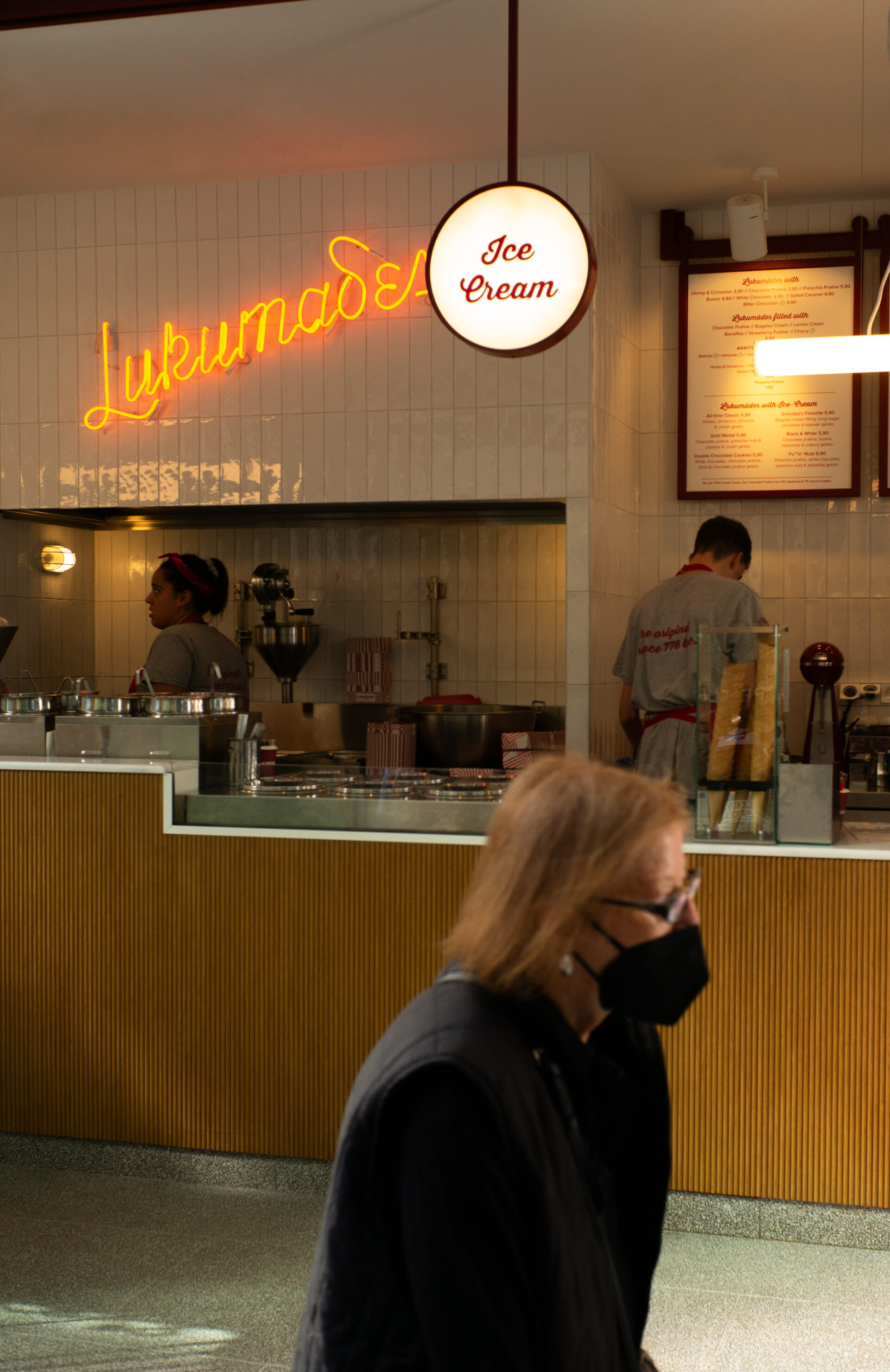
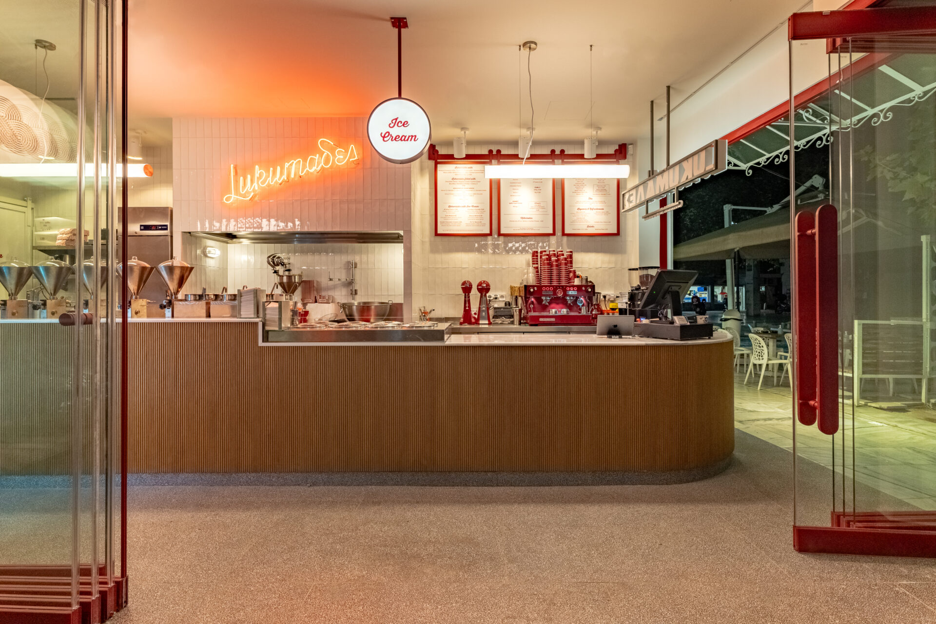
Many interventions were needed for the space to acquire its current form. The main direction in the design process was to respect the location and its meaning. This was translated into clear lines and materials. A white marble counter, oak paneling, handmade white tiles and granite gladding on the exterior walls were the primary material palette. On the floor, mosaic-like tiles were used, as the original/old mosaic found in the space -after the removal of three layers of tiles- was severely damaged and unfortunately couldn’t be restored.
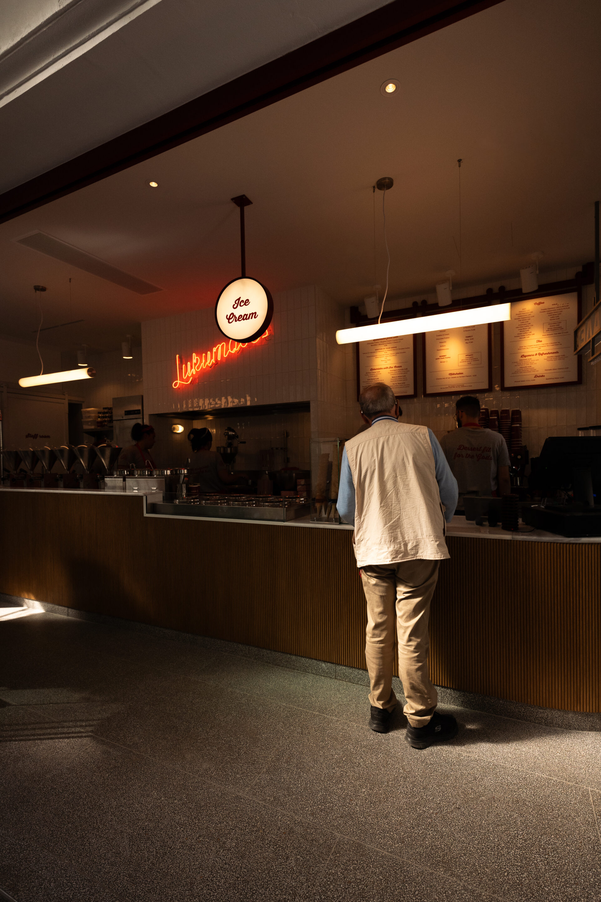
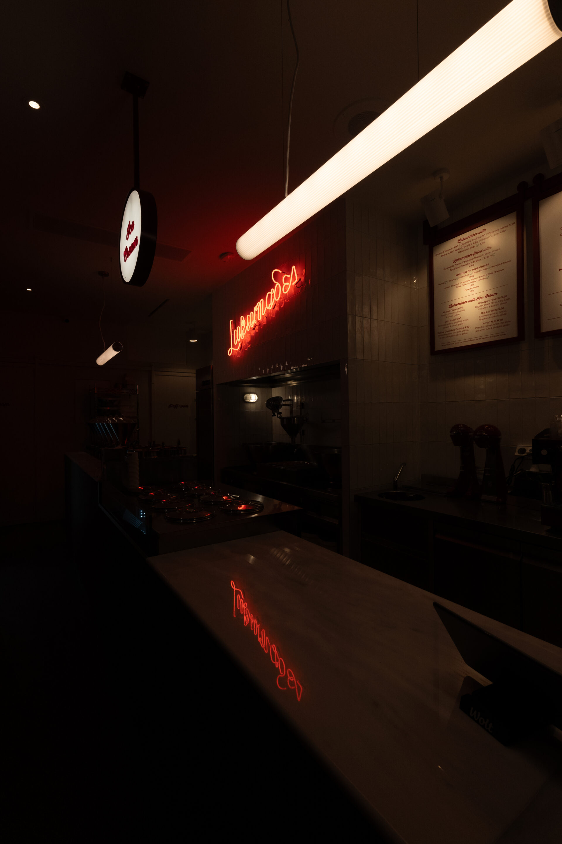
The main selling product, a Greek delicacy ‘loukoumades’ are produced and served immediately. The choice of filling, coating, or accompaniment, makes the visibility towards the kitchen a fundamental element. The narrow counter was the only solution so as to enclose all the functions. Coffee production area is placed side by side with the cash register at the very front, followed by ice cream counter and the cauldrons with loukoumades. In all uses transparent visibility was achieved throughout the store due to the -both sided- opening windows. The auxiliary uses were placed at the end of the product/service line.
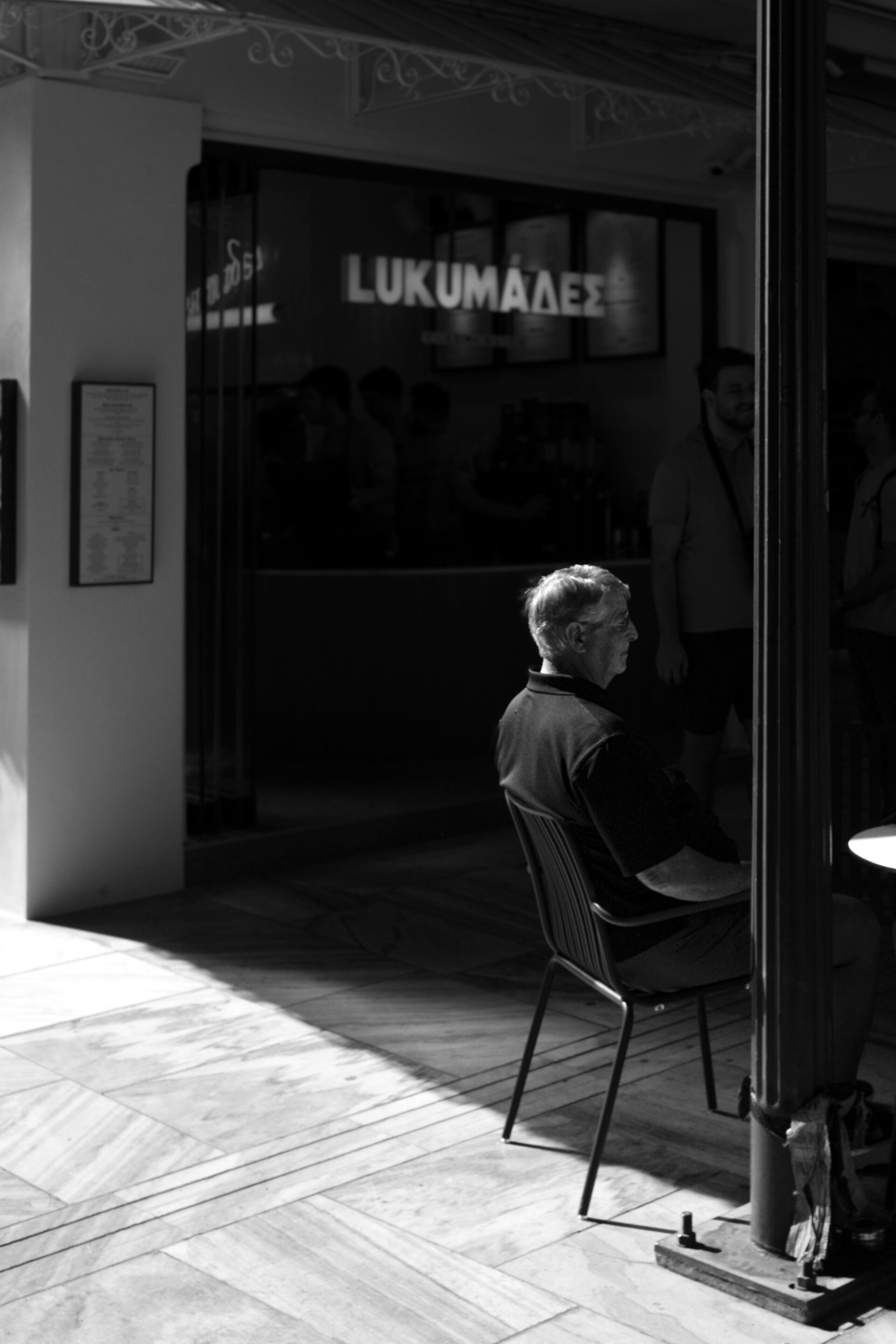
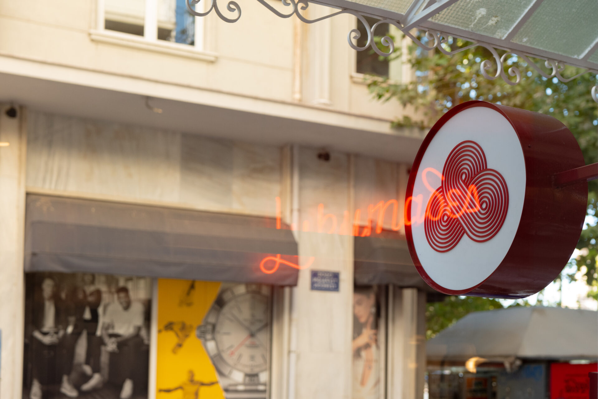
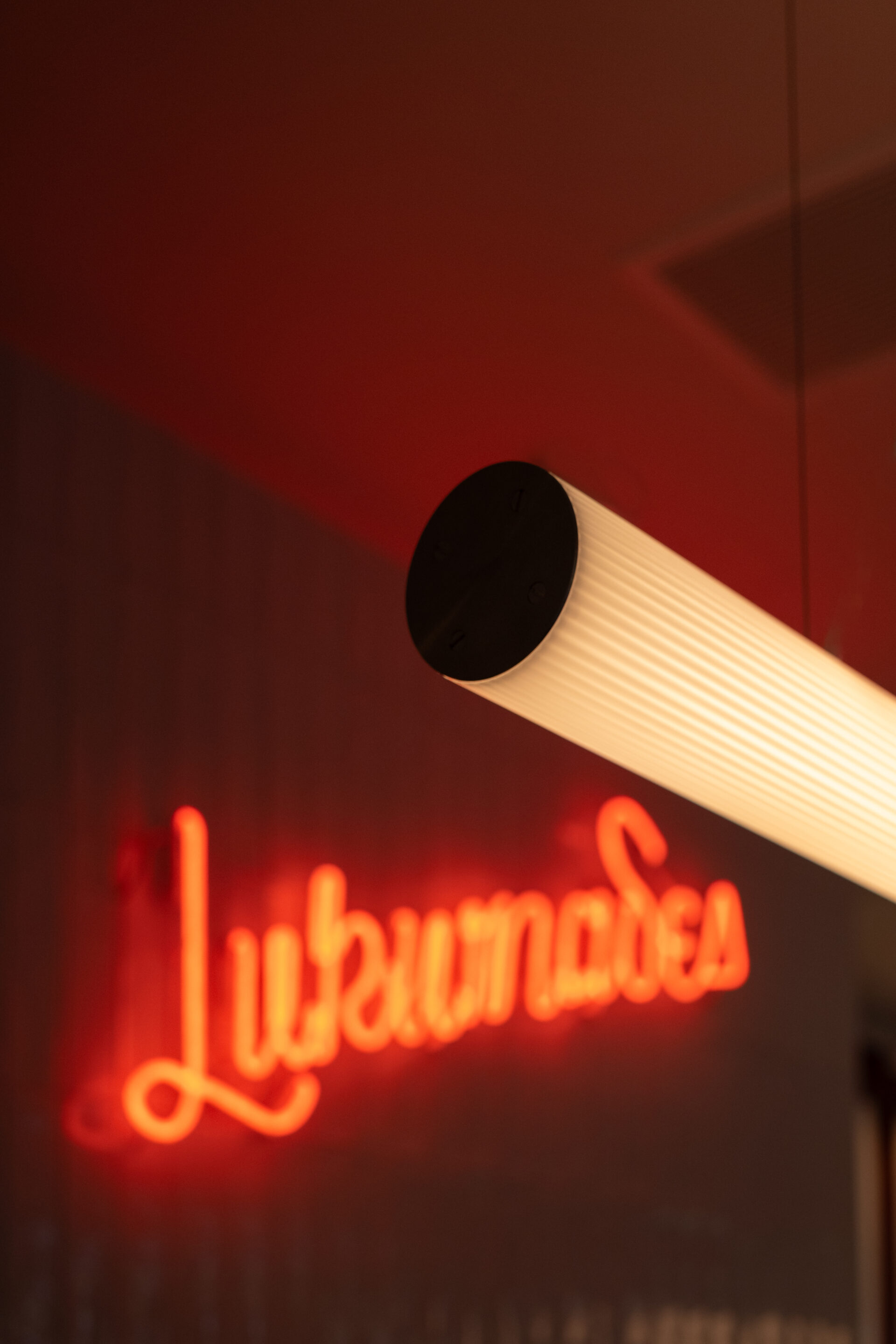
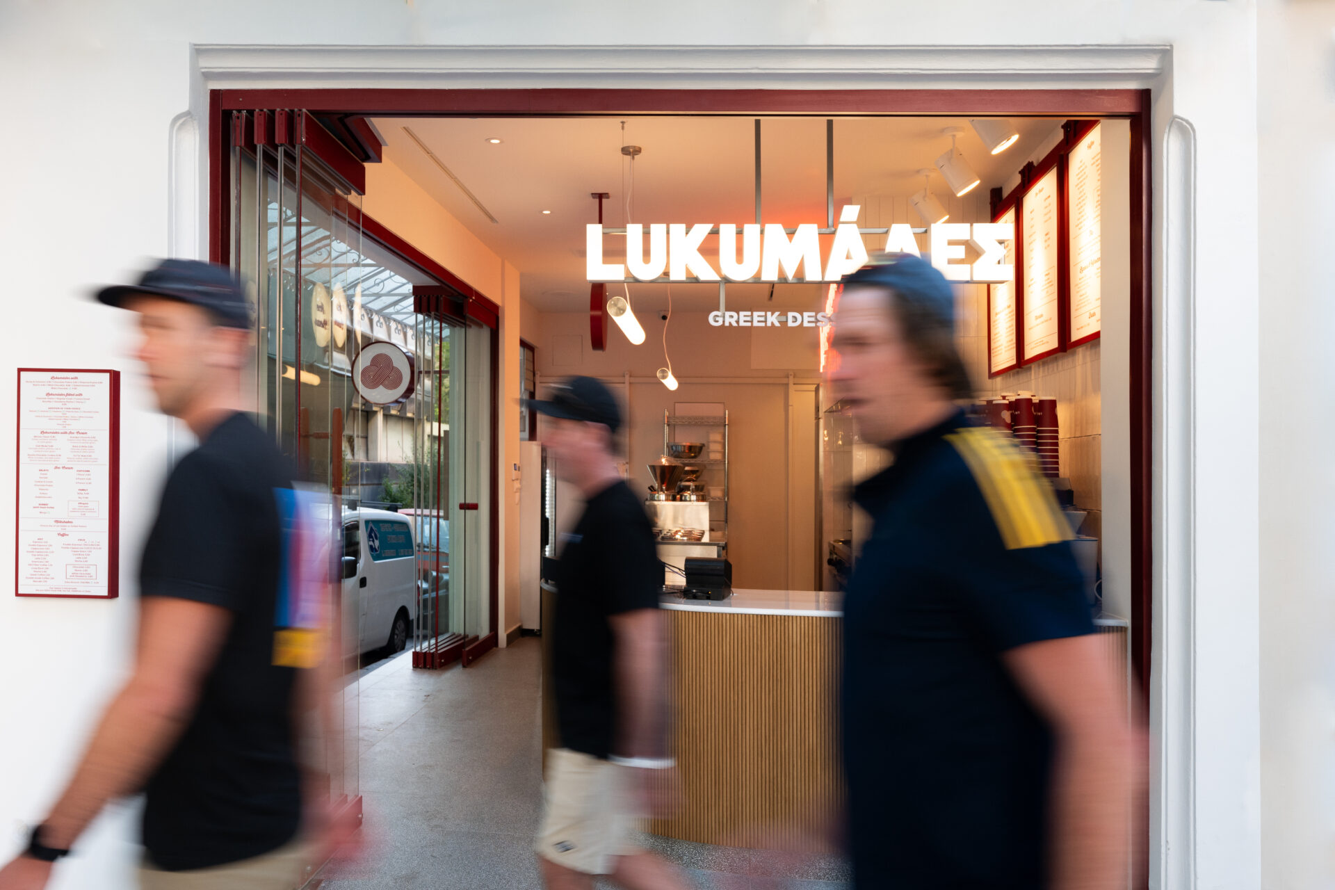
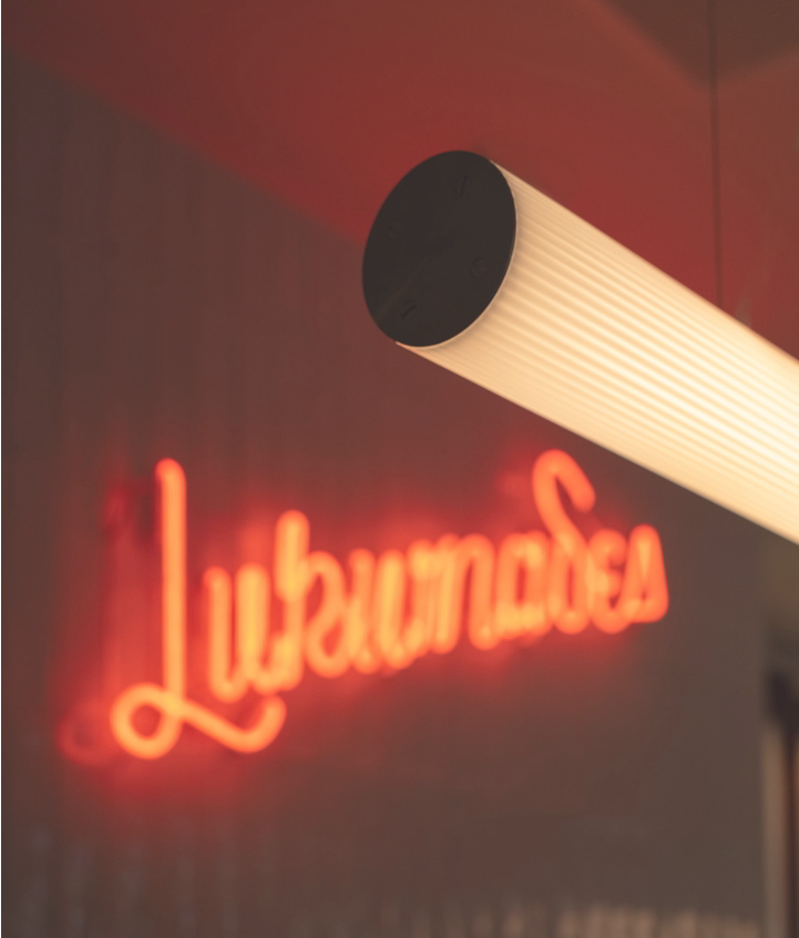
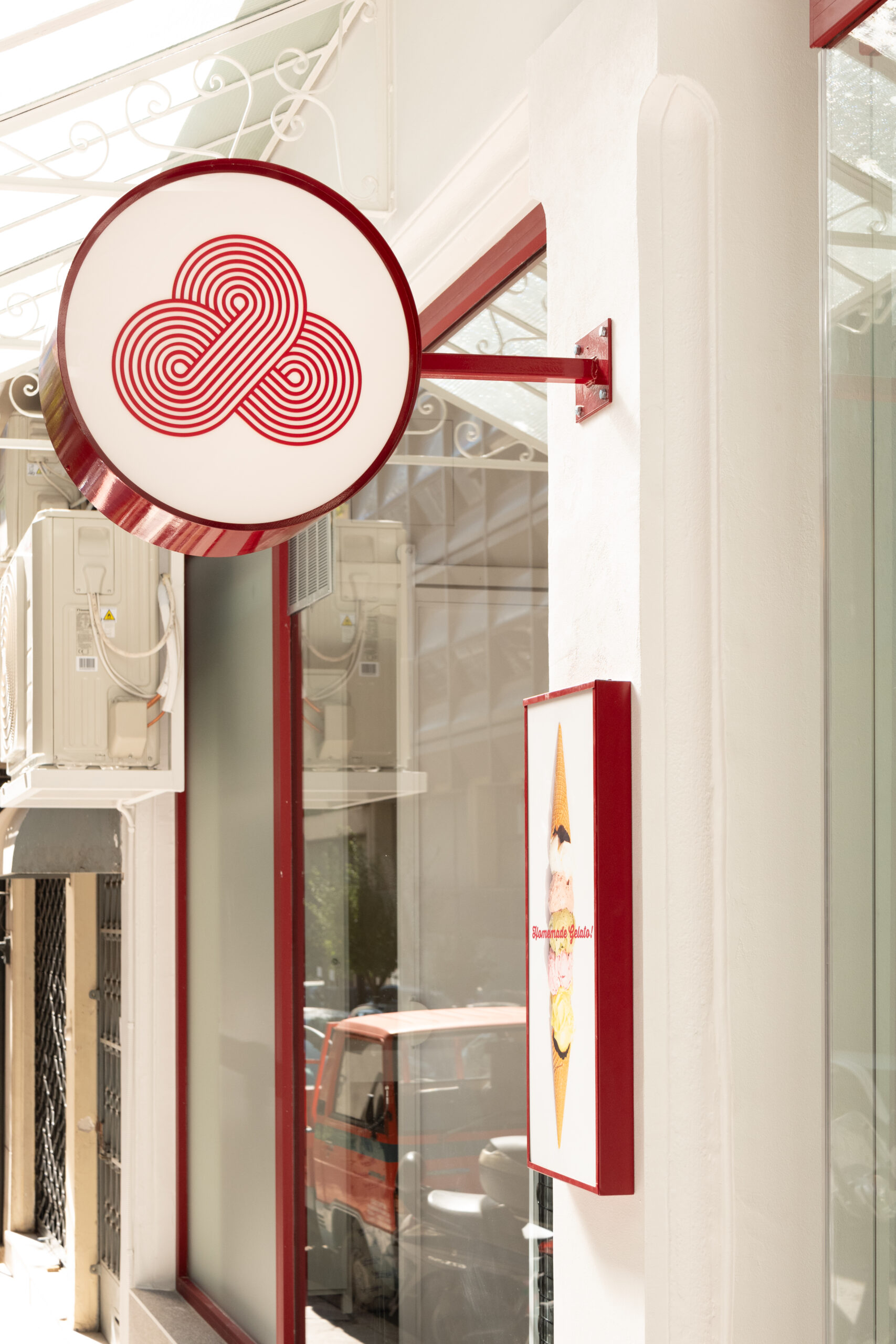
Decorative details in dark red elements -as per the corporate identity- combined with targeted and simple lighting, create a setting that the customer can observe even from the exterior space of the store. Important detail is the signage of the store, placed on the inside. Although the logo is primarily expressed in dark red, here it was chosen to be used in white so as to harmonize with the store’s location.
Publications
LUKUΜΑΔΕΣ acropolis
Interior Design